Display options for data record types
With the display options, you can define which data record information is displayed in lists and link lists. Additionally, you can define custom icons for the data records. You can define these settings for each data record type individually.
Procedure
- Start the App Designer.
- Open the view menu.
- Click Display options for data record types.
- The Display options for data record types window opens and you can define your customizations.


Available options
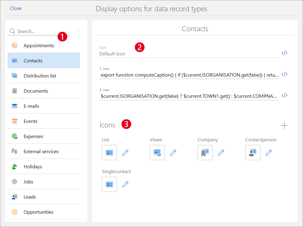
Field/Block | Description | |
|---|---|---|
❶ | Data record type | In the left column, you select the data record type for which you want to define settings. |
❷ | Icon | The Icon field displays the type of icon in use. Note SmartWePremium Using scripts, you can customize when which icon is displayed. For example, you can display different icons for tasks depending on the editing status. The icons used must have been uploaded in the ❸ icons area. After clicking this button you can enter a script. |
1. row | Select the value you want to be displayed in the 1. row. The value in the first row is displayed in a large font. Furthermore, the value in the first row is displayed as the tab name when the data record type is opened in SmartWe. | |
2. row | Entering a value in the 2. row field is optional. The value in the 2. row contains additional information about the data record and is displayed in a smaller font in lists. | |
❸ | Icons | In the Icons block, you can upload custom icons for the data record type and views. Additionally, you can upload custom icons. You upload new icons by clicking the button to the right next to the Icons heading. You can customize existing icons by clicking the button to the right next to the respective icon. You can upload the icons in .svg and .png format. To ensure good quality, we recommend you use an icon in the .svg format, which is scaleable. The Icon name must be entered in lower case letters and must not contain any spaces or special characters. |


