Editing a database field
You edit an element by clicking the element.
Database field
Select the Database field you would like to display.
Editor mode
In the Editor mode field, you define which editor is to be used for a field of the Markdown field type.
You can choose between the WYSIWYG and Markdown options.
For the formatting to be displayed correctly in the data record, the corresponding field of the Markdown field type must have been added both to the editing and the read mode of the data record type.
The formatting can only be displayed in the editing and read mode of the data record.
Formatting cannot be displayed in views, dossiers, search results, or any other form of list. Instead, the Markdown formatting characters are displayed. The same applies for the desktop client: the formatting is not displayed.
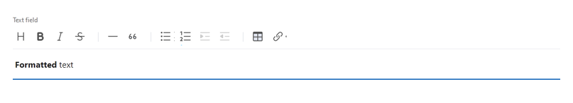
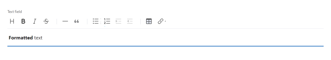
In the read mode of a data record, the display is always the same whether the WYSIWYG or the Markdown formatting has been selected. In the editing mode, the settings has the following effects:
- With WYSIWYG (What You See Is What You Get), you can see the formatting directly after input and use buttons to define the desired formatting.
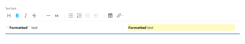
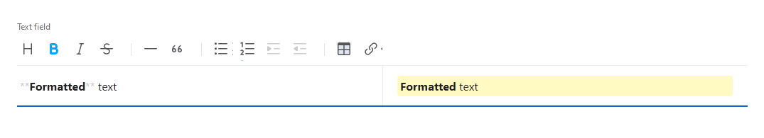
- With Markdown, you can enter formatting commands during input. Moreover, the same buttons are available as in the WYSIWYG editor. The input field is separated into two parts: on the left, you enter the text, including formatting commands. On the right, you can see a preview of the formatted text.
The following formatting options are available:
Function | Description | |||||||||||||
|---|---|---|---|---|---|---|---|---|---|---|---|---|---|---|
Headers | With this button, you switch between headers and text. Six different levels are available for headers. The Markdown formatting character for headers is #. Enter up to six # after each other to achieve the desired header level. As of the seventh #, the text is formatted as normal text and the # characters are displayed in the text. You need to include a space between the # and the text.
| |||||||||||||
Bold | With this button, you format the selected text in bold. The Markdown formatting character is **. When using these characters, you need to insert the ** before and after the text you want to format. You must not insert a space between the ** and the text. | |||||||||||||
Italic | With this button, you format the selected text in italics. The Markdown formatting character is *. When using the character, you need to insert the * before and after the text you want to format. You must not insert a space between the * and the text. | |||||||||||||
Strike | With this button, you format the selected text as strikethrough. The Markdown formatting character is ~~. When using these characters, you need to insert the ~~ before and after the text you want to format. You must not insert a space between the ~~ and the text. | |||||||||||||
Line | With this button, you insert a line. The Markdown formatting character is ***. When using these characters, you need to enter them into a separate row that does not contain any other characters. | |||||||||||||
Blockquote | With this button, you can format a text as a quote. The Markdown formatting character is >. You need to enter the > at the start of the line. | |||||||||||||
Unordered list | With this button, you can insert an unordered list. The Markdown formatting character is *. You need to enter the * at the start of the line followed by a space. Tip You can indent the text within the list by pressing the tab key after entering the bullet point. However, you always need to enter the first point in the list without indentation as the bullet point is otherwise displayed in the text. Alternatively, you can use the Indent button. Example Copy * First bullet point in the list. * Second bullet point in the list. * Indented bullet point under bullet point 2. | |||||||||||||
Ordered list | With this button, you can insert a numbered list. The Markdown formatting character is a number followed by a period, for example, 1. You need to insert the formatting character followed by a space at the start of the line. Tip You can indent the text within the list by pressing the tab key after entering the bullet point. However, you always need to enter the first point in the list without indentation as the bullet point is otherwise displayed in the text. Alternatively, you can use the Indent button. Example Copy 1. First item in the numbered list. 2. Second item in the numbered list. 1. Indented item | |||||||||||||
Indent | With this button, you can indent a list bullet point or an item in a numbered list. | |||||||||||||
Outdent | With this button, you can outdent a list bullet point or an item in a numbered list. | |||||||||||||
Insert table | With this button, you can insert a table. You can use the cursor to select how many columns and rows you want to create. You can only retroactively insert more table rows or columns when using the Markdown editor mode. You can extend the table using | characters. Example The following example shows the Markdown code for a table with a header. A header is displayed by inserting an empty row below the first table row including the following code: | Column header 1 | Column header 2 | | --- | --- | | Row 1 | Information on Row 1 | | Row 2 | Information on Row 2 | | |||||||||||||
Insert link | With this button, you can insert a link. After you click the button, a window opens in which you can complete the following fields: URL and Link text. The Markdown formatting characters are [] and (). The text to display is written in the square brackets [], and the URL in the round brackets () that follow directly after. |


Call type
In the Call type field, you define how the call is dialed.
The Call type field is only available for field of the Telephone type.
Function | Description |
|---|---|
Calls per telephone number | The default telephony program calls the telephone number. Users can only enter characters which are accepted by telephone systems, for example, + or digits. |
Calls per user name | The default telephone program calls the user name. This setting is relevant for Skype for Business. |
Visible rows
In the Visible rows field, you enter the maximum number of displayed text rows.
The Visible rows field is only available for Text fields.
In read mode for a data record, you only see the number of rows displayed which the user has set in the field. If, for example, 20 visible rows have been allowed for a text field, but a user has only entered 2 rows, then the field in read mode will only be 2 rows high.
In editing mode of a data record, the complete height is displayed independent of the extent of the entered text.
Dynamic input help
SmartWePremium
In the Dynamic input help field, you can enter a script. Click the field to open the script editor.
The entry in the Dynamic input help field overwrites the entry in the Global dynamic input help field.
Background color
You can customize the color. To do so, enter a hexadecimal value or select a color from the color palette.


Alignment
Here, you can define the alignment of the field: Left, Centered, or Right. The content of the field is then aligned according to the available space. You can define the alignment in the read mode of a data record.
Icon
Icons are displayed in front of the field. You can either select an icon from the list, or upload your own icons. You can use icons in the read mode of a data record.
Function | Description |
|---|---|
| Using this button, you can select an icon from the list. All the icons that are available for this app are displayed in the list. In the list, you can find both a preview of the icon and its name. |
Using this button, you can remove the currently selected icon. This button is only displayed if an icon has already been selected. | |
If you click the button, the Edit icon window opens. You can change the following settings in the this window:
This button is only available for your own icons. | |
This button opens the Upload new icon window. Procedure
|


Device classes
In the Device classes field, you can define the types of devices on which the elements can be displayed.
Option | Description |
|---|---|
Mobile | The element is displayed in the SmartWe Mobile App. |
Web | The element is displayed in SmartWe in the browser. |
Visible
With the Visible option, you define whether the element should be displayed.
SmartWePremium
With this button, you can also enter a script to individually define the visibility.

Enabled
With the Activated option, you define whether the element is activated or deactivated.
If you clear the checkbox and thus disable the element, it will be displayed in read mode only. If buttons are available for the element, they will be displayed grayed out.
The Activated option is only available in the editing mode of a data record.
SmartWePremium
This button allows you to enter a script as an alternative if you want to individually control the activating and deactivating of the element.

Only readable
With the Only readable option, you define whether the element can be edited or is displayed in read mode only.
If you activate this option and the element is displayed in read mode only, any existing buttons will be completely hidden.
The Only readable option is only available in the editing mode of a data record.
SmartWePremium
This button allows you to enter a script as an alternative if you want to individually control under which conditions the element is displayed in read mode only.

Display caption
With the Display description option, you can define for each field individually whether you want to display the field label or whether you want to hide it.
Description
The following options are available to change a static header or title.
Function | Description |
|---|---|
With this button, you remove the current header. | |
| With this button, you select a header. In the list, you can find all texts available for the open app. |
With this button, you change the text of the header. Note This text may appear in different locations. If you edit the text, it will be changed in all locations. System texts cannot be edited. | |
Using this button, you can enter a new text.
|


Hide automatically
For an element you can set how it should behave if no content is available.
Option | Description |
|---|---|
Activated | An empty element is always hidden. |
Deactivated | A empty element is always displayed. |
Default (activated) Default (deactivated) | The setting of the parent element is adopted. The brackets always contain the value that is set for the parent element. A parent element can, for example, be the z-layout. |
Upon field value change
SmartWePremium
Here, you can define a script which is run upon a field value change. Click the field to open the script editor.
Server field calculation
SmartWePremium
In the Server field calculation field, you can enter a script. Click the field to open the script editor.
Field validation
SmartWePremium
In the Field validation field, you can enter a script. Click the field to open the script editor.
Global dynamic input help
SmartWePremium
In the Global dynamic input help field, you can enter a script. Click the field to open the script editor.
The entry in the Dynamic input help field overwrites the entry in the Global dynamic input help field.